How to Create a Highly Visible Construction Sign
4 Tips for Creating the Best Construction Signs

Are you looking for ideas on how to make your construction site safer for the employees and any passersby? Creating a billboard design is much easier than creating construction signs because you can be creative. However, the latter signage requires you to be precise so that people know what lies ahead.
For example, you have a new construction project going on. It is still in the initial phases of breaking the ground and laying down the skeletal work. Even though you have put a clear boundary around the construction site, there are still a few areas that are left unprotected. At night, the site is shrouded in darkness and it is a bit difficult to see. A man jogging suddenly falls in a ditch on your construction land because you had no signs up.
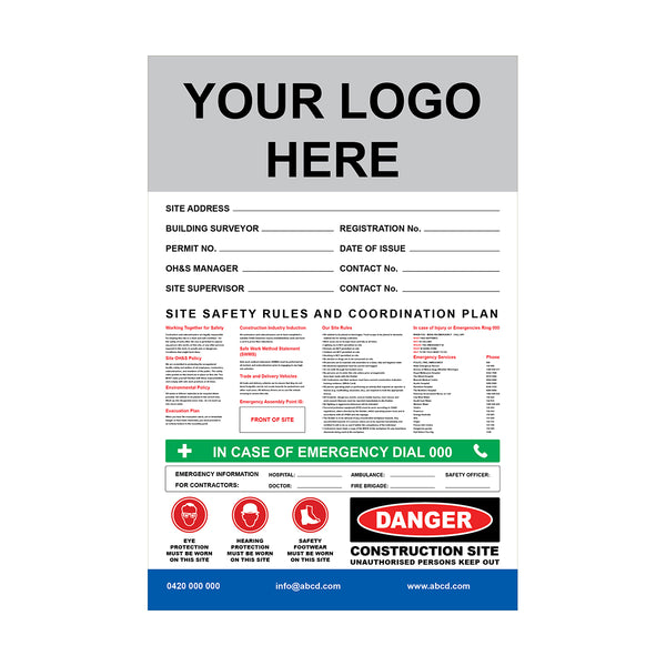
Construction signs are not just for civilians but also for employees so that they know what precautions to take when they are entering a certain area. To make sure that your workers as well as the people passing by the site understand the construction sign, you need to come up with designs that make them stand out.
Following are a few construction sign design tips that will help you create the perfect sign:
Tip #1
Think Scale and Size
When designing a construction sign, you need to think about its size and scale.
Why?
Because whatever you are putting on it cannot look crowded. Will the people who are driving by be able to see and read it from afar? Is it the right size so that people can view it in less than 3 seconds? You need to consider these points and then create the perfect scale so that the sign is clear.
Tip #2
Consider Location
The placement of the sign is just as important as its size. We are not talking about the physical address of the placement but the construction sign zone! Are there any trees or shrubs that might block the view? Is there are sharp turn that will prevent people from seeing the sign in? Are there too many billboards or other signs nearby?
The rule of thumb is to place a construction sign in an area where there are fewer signs nearby but more traffic. This will increase visibility and allow people to read it straight away.
Tip #3
Choose the Right Colours
The construction sign colour is not set in stone. The five colours that you typically see are red, yellow, orange, blue and green. The last two are seldom used. The reason why the colours red and yellow are used the most is that they are visible. They spell “danger” or “warning”, which is quite effective. For construction sites, you need to keep two things in mind: visibility and contrast. Make sure that the sign clashes with the construction site because that way it will be visible.
Tip #4
Typography and Contrast
Most of the construction signs have capital letters with a font that has no curves. This makes it easier to read. As for contrast, if the picture on the sign is in black, then write the text in white. A few other contrast options are black over yellow, blue over white, yellow over red and white over green.
To conclude, the visibility of a construction sign depends on five things — the size, placement, colour, contrast and typography. If you are looking for signage for your construction site, then visit Vividads. The company offers various types of signs and boards. To know more about their products, call at 1300-72 16-14.
-
-
View DetailsCaution Wet Floor A-Frame SafeAs low as $12.00 inc GSTSale
-