Tips to Create Great Outdoor Signs
5 Tips for Creating a Unique Outdoor Sign

Create a super-engaging yet unique representation of your brand, print it on a sign and watch as people are drawn to your business— sounds easy, right? Well, it just seems easy enough on paper. When you are designing a unique outdoor sign, you have to consider many factors. This is because an outdoor signs serves as a great marketing and communication tool that enables you to connect with your target market and potential customers. It plays an even greater role in shaping brand recall and brand retention. An effective outdoor sign helps invoke a response from customers and prospective consumers. Here are a few tips to create effective outdoor signs:
Size Matters – Make it Big
Regardless of what anyone says, when it comes to outdoor signs – size matters! An open house sign frame should be big enough that it can be seen by all passers-by, whether they’re on foot or are driving by. This bigger the sign, the more easily people will be able to spot it from afar. Ensure that the text on the sign is big enough that it is legible. Conduct a drive-by test to see how the sign looks.
Colors – Make it Bright
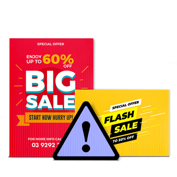
Don’t we all love big, bright things? The understanding behind the color of the sign extends further than its aesthetic appeal. Sure, high contrasting and bright colors play a major role in grabbing the audience’s attention, but colors also invoke a psychological response. A study revealed that high color contrast increases outdoor advertising recall by over 38 percent. Make sure that your outdoor sign incorporates the color of your brand so that your audience recalls your brand the instant they spot that color. Make sure that the color combination of the sign attracts the viewer's eye and doesn’t end up adding to the confusion of the busy lane.
KISS – Keep it Short and Simple
The average person can read about four words per second. This means you have a few brief seconds to grab the attention of your audience, convey your point succinctly and limit the text as much as possible. Ponder over the message you want to deliver to your audience, sum it into a few words and keep editing until you get rid of the fluff. Make sure that your primary message remains intact. Think of it this way; place yourself in the audience's shoes and think, “Will I read this?” If your answer is no, then you know what you have to do!
Images and Graphics – Make it Attractive
Did you know that images are more effective than text? Well, that’s what most people seem to think. Images can help set the mood for your outdoor sign, but make sure you keep them simple. If you’re promoting your brand, make sure you include your brand’s logo and images or graphics that clarify your message in a glance. However, images and graphics can only help support your message and not drive it.
Typography – Font Matters
You might be too focused on developing the content of the outdoor sign that you miss out on its aesthetics. We’re here to remind you that font matters! While you may want to use light or delicate fonts, remember that such text won’t captivate your audience. Your font size and type will influence the readability and visibility of the text. Choose a bold font type and make sure it complements that background of your boards, for instance, white font over a red background.
The Bottom Line
A unique outdoor sign will help your brand stand out. So use the tips mentioned above and remember, the location of the signs is also important.
Happy marketing!
-
-
View DetailsRP Skin - Printed DirectionalAs low as $9.00 inc GSTSale
-
View DetailsHW Frame - Pointer Sign StakesAs low as $65.00 inc GSTSale
-