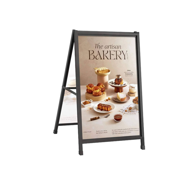
How to Design Posters for Advertising

Posters have been around for so long because they’re great for advertising events, books, restaurants and pretty much anything else that comes to mind. Unlike standees, they can be placed anywhere –walls, public noticeboards, and bus stops, just to name a few.
But not all posters work the same way. Some are designed so beautifully that everyone’s almost instantly drawn to them. Then there are those that don’t catch anyone’s attention because of their lacklustre design and fail to serve the purpose they were made for.
Follow these simple tips if you want to make an engaging poster that grabs everyone’s attention right away.
Keeping Your Audience in Mind
You may already have an idea in mind about what you want your poster to look like, but you shouldn’t forget your audience. Even if you love your design, it may not look appealing to the people you’re trying to attract.
You need to think about your audience and figure out what they’d like to see. Give them what they want by designing your poster in a way that would make complete sense to them. Ask yourself if your customers would like an image-heavy poster or one that has a lot of information in it.
Movie posters will be designed a lot differently than event posters, so you need to take your audience’s preferences into consideration when you’re making design decisions.
Choosing the Right Colours
Colours alone can make a huge difference in your poster’s impact. They set the tone for your poster and can even get people to take the action you want them to take. The red colour is known to get people excited, so if you want a great turnout at your sales event, then you should consider incorporating it in your poster design.
If it’s a company event, then you’ll have to work with your brand colours to stay consistent. But it wouldn’t hurt to deviate every once in a while to stir things up a bit. If you’re designing for a kid’s event, then you need to pick bright and vibrant colours.
Whatever you do, don’t pick colours that don’t complement each other nicely. You need to use colours that have the right contrast or they’ll make the text visibly difficult to read.
Text Placement and Font
Typography is another area you need to pay special attention to. Everything from the text size to the font and placement matters. If you’re going for a modern look, then you need to pick a cool and clean font like sans serif and get your message across.
If you’re trying to advertise for a fun and upbeat event, then experiment with other fonts to get the desired effect. The layout of your text is also important because you need to make sure the readers have their eyes on your call-to-action and other important information.
Final Words
When designing a poster, you need to keep in mind that your message is the main focal point in your poster and isn’t hiding between images or other text. It should be placed in such a way that it’s impossible to miss.
A good poster will get people to take the right action, whether it’s to attend a concert or watch an upcoming movie. You need to pull out all the stops while designing your poster to get noticed by your audience.