Things to Avoid When Designing Your Exhibition Stand
How Not To Design Your Exhibition Stand

Participating in exhibitions or trade shows can be a great marketing move for your business. When taking part in such exhibitions, you need to ensure that you have a top-of-the-line exhibition stand. Similar businesses participate in exhibitions or trade expos. To attract your customers, you need to stand out from the rest of the crowd. The best way to do this is by building an exquisite exhibition stand. Incorporating certain elements in your exhibition stand can drive out traffic rather than attract it. Here are a few things to avoid when designing an exhibition stand.
Don’t Waste Booth Space
The size of your exhibition stand will be determined by the kind of products you’re displaying and your personal choice. Design an exhibition stand according to the space that’s been allotted to you by the organizers. Make sure that the stand is not over or undersized. Exhibition stands come in different sizes, such as 3x3 exhibition stand or a 2x3 exhibition stand. An oversized yet underutilized stand or an undersized and overdone stand can seem pretty unappealing. If the space is limited, then ensure that you utilize it well by improving the flow of your display area.
Pay Attention to Lighting
Lighting is an element that is often overlooked, even though it plays a huge role in the design of your exhibition stand. Lighting can create and enhance the aesthetic appeal of your stand. The lighting of a stand often varies according to the purpose of the stand and the product being showcased.
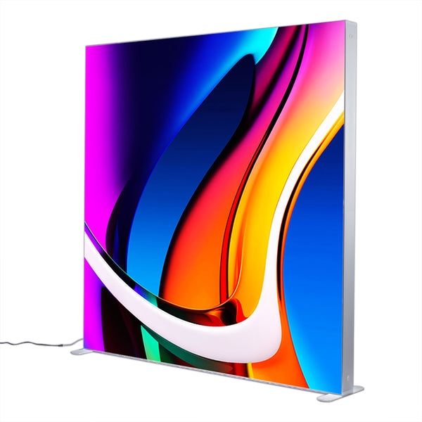
If the venue lacks proper lighting, then consider adding a few lighting options to your exhibition stand. Just make sure that you don’t go overboard with colored or spot lights as it can be very unappealing. Similarly, if an exhibition stand isn’t well lit, it might not even be able to grab the audience’s attention.
Don’t Overuse Text
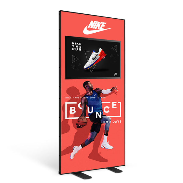
When designing your exhibition stand, make sure that you don’t go overboard with the text. Your exhibition stand isn’t a brochure that requires extensive and comprehensive information. Try to keep the text visible, minimal and readable. Limiting the amount of text doesn’t imply that you reduce the font size too as it can seriously hinder its readability. Use bold colors and eye-catching images to grab the audience’s attention.
Don’t Print Without Proofreading
When designing your exhibition stand, go over all the printed material to ensure there aren’t any mistakes. Sometimes printers can mess up your perfect stand, but it’s your responsibility to proofread it before setting it up at the venue. Grammatical errors or typos on your exhibition stand can have a pretty devastating impact on the success of your event.
Use Colors Wisely
Colors are a great tool used to build powerful cognitive associations. You can easily recognize a brand based on their color scheme. When it comes to the color of your stand, make sure you pick them wisely. Incorporate bright and bold colors but don’t overdo them. Don’t use very dark or very bright colors, rather pick ones that can catch your eye at first glance. This way the audience will be more likely to remember your brand.
When building an exhibition stand, make sure you have your ideas clearly mapped out. You can create an entire atmosphere by switching up different elements of your exhibition stand such as lighting, colors, textures and even layout. The design of the exhibition stand has to be perfect and must align with your brand as it can greatly influence your audience.


