Designing the Best Pull-up Banners in Melbourne
Designing Tips for Pull-up Banners in Melbourne

Pull-up banners in Melbourne are a great marketing option. Flexible, portable and highly effective you can place pull up banners anywhere to share your brand message.
However, let’s not forget that they are only as effective as their design and style. If you chose a poor design, you will get poor results. If you want your pull up banner to make the impact you want it to, your focus should be on the design of pull-up banners in Melbourne.
If you’re wondering how to design a pull-up banner here are designing tips to help you.
Place Your Logo on the Top
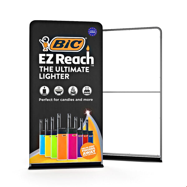
The first place the audience looks at or pays attention to is the – top of the banner. Use the top-most part of your pull up banner for your company’s logo and keep any other crucial information such as the brand name towards the center.
Your main message should be highlighted in a way that it instantly grabs the attention of the audience. Doing so gives you the opportunity to raise brand visibility.
Think Top-To-Bottom, Left-To-Right
Think about it this way – you’re always taught to read from left to right and from top to bottom. Your customers also apply this same reading method. Consider this factor when putting content or the general layout of your pull up banner. You want to make sure that your content and graphics are placed in a manner that is easy to read and which the eye naturally follows. Keep your words to a minimum and only focus on the relevant information.
Use Images
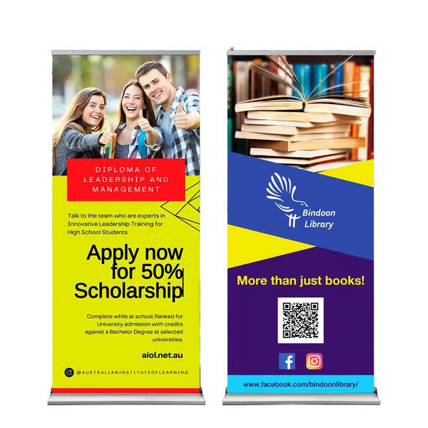
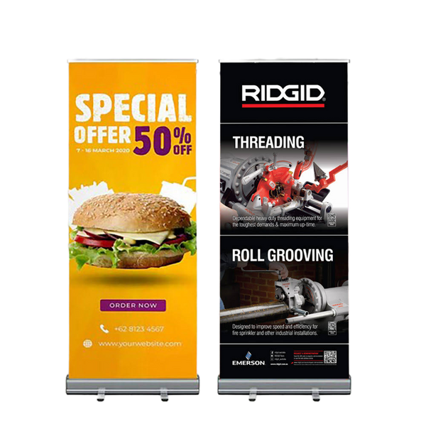
Images are a hugely captivating addition to your pull up banners in Melbourne and they will make your banner stand out even more. Before incorporating any images though, make sure that they getting printed from a high-quality place which can provide a great finish. Poor visual elements don’t get the audience’s attention.
Add Colors
Colors truly are your friends. Put yourself in the shoes of your target market and think – will I look up at a dull-colored banner let alone read the content on it? If your answer is no, then you know what to do. Even though bright colors attract the human eye more, there are other factors to consider as well, when designing a pull-up banner.
Your banner color should overall support the color of your logo which will aid in the reinforcement of your brand. Colors such as black and grey are neutral colors whereas bright colors such as pink and red are vibrant, welcoming and energizing. Also, choose colors that complement each other as poor color usage can be very off-putting.
Readability of the Text
Text must always be kept minimal. Ensure that its readability is high and that your message is loud and clear. Make sure to choose a bold and sophisticated font that can be spotted from afar.
Use these tips the next time you design your pull up banners in Melbourne and see the difference it makes!


